Service Design Award 2020/21 Finalist Project
Inclusive Digital Services for the Municipality - by Koos Service Design
Category: Professional Non-profit / Public sector
Client: Gemeente Amsterdam
Location: Netherlands

Little over 850.000 citizens live in this diverse, beautiful city. From Marc to Mohammed. From baby to granny. From garbage collector to PhD student. Every citizen has their context, needs, wishes and challenges. How to design online services that can be used by everyone?
Category: Professional Non-profit / Public sector
Client: Gemeente Amsterdam
Location: Netherlands
It is the ambition of the municipality to increase the self-reliance of the citizens and to combat inequality. To create a city, supported by technology, that has value for all of its citizens. Knowledge, information and education should be accessible and available for everyone.
The objective of the project was to create guiding design principles for the development of inclusive digital services. These design principles will ensure that all citizens can benefit equally. The municipality teamed up with a service design consultancy to tackle this challenge. Together we selected three diverse target groups of which we expected would have the most issues with digital services.
In sum, we are proud to say we conducted 57 interviews, completed 3 design sprints and built 3 prototypes in about 30 days. The results, values transformed into design principles, are used every day by the municipality to give guidance in the improvement of digital services. The outcomes are used at this moment for the refinement and development of new solutions (both online and offline) and to start a conversation around inclusive design. This way, we are one step closer to offer citizen services working for everyone equally.
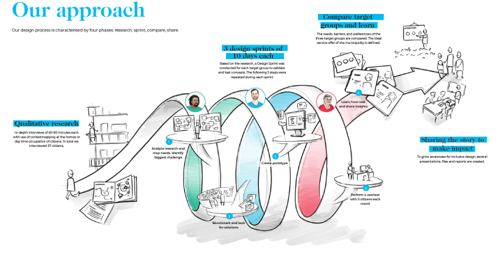
“We conducted 57 interviews, completed 3 design sprints and built 3 prototypes in about 30 days”
Qualitative research & three design sprints
Inclusive design is important, especially for service designers in the public sector. If we just rely on our own experience and abilities, we will design services that are easy for some people to use, but difficult for everyone else. It is our mission to:
To design inclusive online services for the municipality, we first needed to understand our audience’s needs, pains and desires. What is the problem we want to solve? For the project, we focused on three research questions:
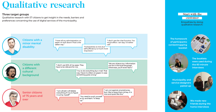
It is simply impossible to speak to everyone. Therefore, a selection was made of target audiences that might have difficulty with online services: citizens with a minor mental disability, citizens with a different cultural background, and elderly citizens of 75 years and over. These groups were selected because they represented three main challenges: cognitive limitation, language barriers and cultural differences, and physical barriers.
The project was divided into three sub-projects one per target audience.
Each subproject consisted of 3 steps: qualitative research, thorough analysis, and a design sprint with user testing. Every subproject took approximately one month to complete.
Step 1: Qualitative research
We believe qualitative research is the go-to method to research needs. Conducting interviews at the home of the interviewee adds an intricate layer of contextual insights that other (or digital) environments lack. Going to the houses of citizens meant that we could have a look at the (lack of) computers, mobile phones and apps.
Step 2: Analysis
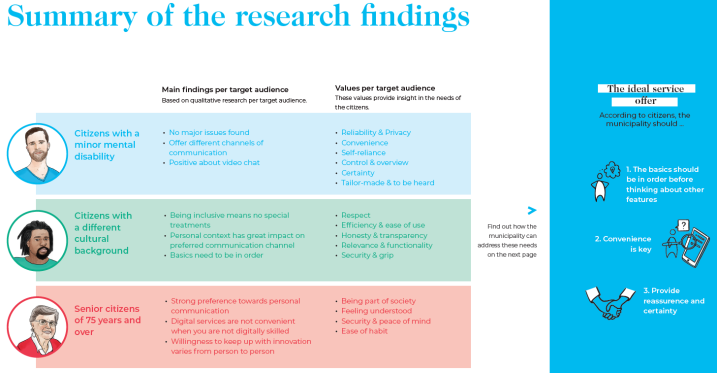
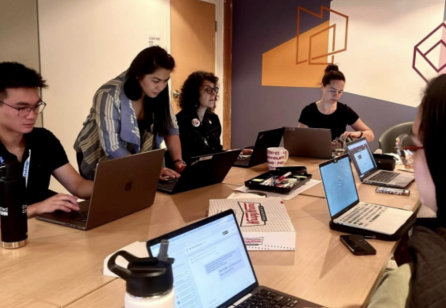
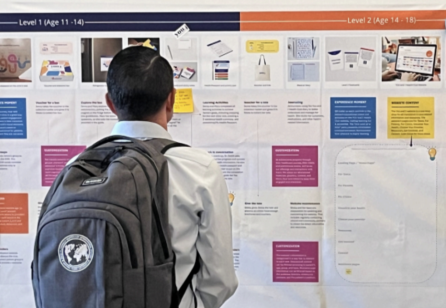
Since the research was very broad and preliminary in the design process, there was no straight path to move from interview transcripts into insights. First, clustering post-its with quotes of the interviews resulted in the formulation of main insights. This allowed for a better understanding of the needs, pains and gains of the target audience. Second, for each target audience, the most important values were listed.
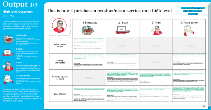
High level customer journeys were made to get an understanding of the steps, activities and experience of using an (online) service of the municipality. This journey consisted of four phases: fantasizing, scanning, planning and transaction. This meant almost all services of the municipality could be fitted in this high level journey. From applying for a parking permit to renewing your passport. Within each phase of the journey, needs, and suggestions on how the municipality can address those needs are listed.
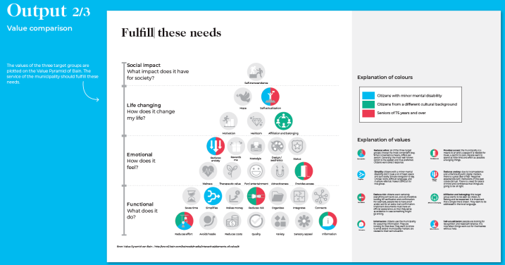
After completing the analysis of all target audiences, all customer needs were plotted on the value pyramid of Bain3. This generated insights on how the target audiences relate to each other and how the municipality can fulfill these needs.
Step 3: Three Design Sprints
For each target audience, a sprint was conducted to get from problem fit into solution fit with customer validation. Two designers were involved in each sprint, consisting of four days in total. On the first half day, the problem was selected and presented to the client. On the second day, a benchmark was conducted and ideas were formulated. Followed by the creation of the prototype and test setup on the third and fourth day. A prototype test was conducted with five participants on the fifth day. Finally, the results were presented to the client. This process was repeated three times, once for each target group.
The scope of the prototype was directed on the biggest insights. For the first sprint, one of the main insights was that citizens with a minor mental disability like to call the municipality when they have a question. In fact, most of them knew the phone number by heart. However, getting the right person on the phone takes time and requires courage, and calls are a big expense for the municipality. This leads us to the prototype question: how might we make digital service more appealing by applying the benefits of calling to digital services?
In one day, we built a prototype of a chatbot. Citizens were invited to test it and try it out. We learned a lot. Part of the testers liked the chatbot because it was just as personal and fast as calling. But we also found that there is a lot of resistance to using technology. Some citizens wanted to take their time when dealing with an issue. They felt that they needed to respond too quickly when using the chatbot.
This process was repeated for the other groups.
All of the 57 participants agreed: it’s all about the basics. However nice or innovative your solution may be, citizens will choose the solution that is most convenient to them.
What “convenience” means, depends on the person. Most often it is something they are already familiar with, like calling or visiting the service desk. Knowing your customer is key in offering the right solution. Therefore, the ideal service of the municipality should be convenient to all citizens, and should provide reassurance and certainty.
As output of the research, the municipality received an extensive report with customer insights, prototype results, and design tools needed to create inclusive services.
“The project is used as showcase to talk about the importance of customer-centric and inclusive design. ”
Did the project match the initial objectives? Yes, absolutely. In the beginning it was not clear what the outcome would be, looking back the output is richer and more practical than we dreamed of. We have learned a lot about the diversity during the project. Some learnings we want to share:
When looking at the impact of the project, three big achievements stand out:
Accelerator for starting more comprehensive research
The solutions that were tested with prototypes during the project. New projects are started to make services more accessible physically. Tests have been done with remote viewing, video-calling, video chat, service tools for the blind & hard of hearing in City Offices and text notification.
Besides, the biggest department of Research, Information and Statistics is building a user platform with experts by experience, e.g. citizens with a disability. They collaborate with these experts more closely in research projects than before.
The municipality is able to provide inclusive services by embracing service design and involving the citizens in defined projects. The platform is set up for all departments in the municipality and to answer political questions.
Finally, services got easier to understand for citizens. Coming up are the projects ‘Digital confirmation’ and ‘Improving the search function of the websites’. Results of user needs are translated into specifically defined projects. Nowadays, when a user asks for extra support in understanding, this can be provided by different services such as one contact person and digital notification. The main goal is that all 872.380 citizens are able to independently use the digital services as much as possible.
Finally, services got easier to understand for citizens. Coming up are the projects ‘Digital confirmation’ and ‘Improving the search function of the websites’. Results of user needs are translated into specifically defined projects. Nowadays, when a user asks for extra support in understanding, this can be provided by different services such as one contact person and digital notification. The main goal is that all 872.380 citizens are able to independently use the digital services as much as possible.
Inclusive design is important. We believe that it is our responsibility as service designers to design services that can be used by as many people as possible. Good design is not about shiny features and fancy functionality. It should work. Be convenient. Simple and understandable by all sorts of people that use the service. It is often hard to go the extra mile of applying inclusive design since the biggest impact is not made in the details but in the majority.
For this municipality, we are convinced that we are one step closer to reaching this ambition. However, there is still a long road ahead. We hope to help other municipalities across the world to improve the inclusiveness of their services.
Project Team:
Serena Westra
Marloes Meerburg
Ingrid Pfrommer
Support: Ingrid Nooijens, Anuschka Sital, Ella Baars, Ton Wallast, Jules Prick, Sanne van der Linden, Stephanie Vastert-Viersma, Winand van Hasselt, Mariska Graat, Kiki den Blanken
Service Design Award 2024 - Student Finalist
Service Design Award 2024 - Student Finalist

Share your thoughts
0 RepliesPlease login to comment