SDN Team
Author - SDN Team

The project was set to design a service concept around long-distance driving (one-hour or longer). A strong focus was set on user research, touchpoint identification and how they could be re-imagined.

Service Design Award 2019 Finalist Project

Xplore - by Sebastian Gier

Category: Student / Umea Institute of Design

Client: BMW Group

Location: Germany / Sweden


Introduction

The project was set to design a service concept around long-distance driving (one-hour or longer). A strong focus was set on user research, touchpoint identification and how they could be reimagined. Another factor was the goal to not stay theoretical and actually prototype touchpoint along the process and make the final result as tangible as possible (movie, prototypes, renderings, etc.).

A unique setup for this 6-months master thesis project was that is was done in collaboration and as a member of the in-house design team of one of the world’s leading premium mobility cooperation and fully at the university. This straightens to collaboration with the stakeholders of the company and brought in more diverse perspectives especially around technology, business and consumer analytics. Furthermore, this also meant the result has to align with the brand experience and its guidelines from a customer experience perspective.

Strategic ambitions for the company like autonomous driving and artificial intelligence played a large role. The scope was for around 2024 which would not allow complete new interior layouts but autonomous driving for all areas of the journey. So a key question from both a business, technology but also human experience perspective was: what experience can we built for this time when the vehicle drives itself.

The goal here was to have a human-centred design process that concluded co-creation and user feedback allthroughout the design project. Along with the process reviews with various stakeholders from business, tech, brand and of course the most important design was a crucial part of the process. While it was a challenge for the project it gave the result on the other side a very direct application and resulted in many further ventures. The target market defined for the project in regards to the largest applications was mainly the USA and Europe.

Process

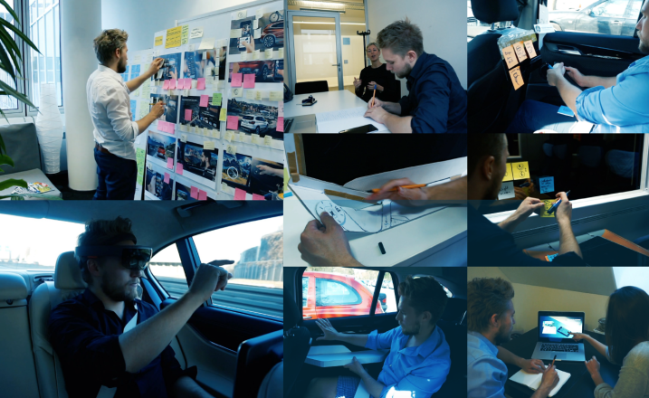
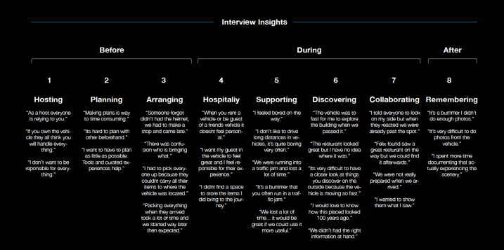
Since human-centred design played a large role user interviews with actual users where a crucial part of the process. On the qualitative side of user research, 18 users were interviewed on their pain-points when it comes to long-distance driving. Besides the interviews, there was a strong focus on observing people and interviewing them in the actual context: in the vehicle. By researching with people in the actual environment it helped to come up with insights people don’t remember when not being in the situation. Looking backwards this was a key enabler for the project.

The connection with the people was kept for the full length of the process to get feedback as concepts got more refined. Besides people that fit into the target group which was the user that often do long-distance drives, travels and are very active in terms sport and leisure activities (which was the framework from the customer analytical stakeholders) it was also important to include people who not fit into this target group.

Therefore I interviews and had “extreme users” being part of the process. These two users were either doing way more than average long distance driving and very extremely active or on the other side two users who just drive short distances and not have a very active lifestyle. By having these users as a contrast it helped to see if the problems and touchpoint I identified very uniquely to the user group or as in most cases can be applied to a larger user base.

Besides these qualitative research aspects, the qualitative aspects of consumer analytics played a large role as well and were influence the process. This indicated more details and behaviour insights of the user base. Other techniques that were used to research on more diverse use-cases of the autonomous driving situation was to benchmark great experiences outside the automotive space. This included benchmarks from the aviation and flight passenger sector, busses, ships, trains and more. Looking at these use cases there can be found many qualities and positive emotions that could potentially be transferred to the automotive space.

For example the London Bus experience: it is a mobility experience people choose specifically to explore their surrounding. What does it make so great? The great view and the audio experience were two aspects that I tried to bring into the automotive space. Creating an experience that comes close to this experience of discovering.

A crucial part as written before was the prototyping aspect. Therefore most of the research and design process was spent in the actual vehicle, either standing or actually on the move. This included not just interviews but also cardboard prototyping, tech prettying (trying out technologies like Microsoft Hololens), brainstorming, wireframing and ergonomic studies (where to place a new interaction or physical touchpoint).

Being immersed in the actual scenario was the main driver for all the innovation coming out of the process when reflecting on this project. It was driving empathy and gave understanding for situations that would not have been possible doing all of it at the desk.

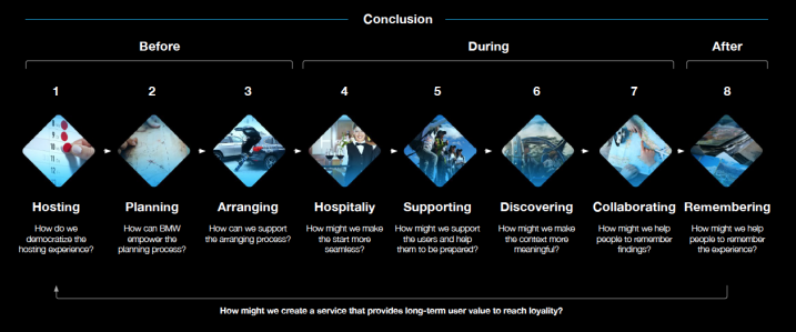
The identified touchpoint and opportunities can be summaries in 8 key-touchpoints. Insights are more detailed explained on the visual slides of this application.

Hosting: The vehicle owner or whoever comes up with the idea to drive somewhere is often the person everyone is relying on. This puts a lot of emotional pressure on the host or organiser. How can we empower the passengers and distribute the responsibilities more democratic?

Planning: It is very difficult to plan as a group. Often passengers don’t feel like they can contribute or participate in shaping the journey Furthermore planning is incredibly time-consuming and adds so much friction to the interaction that people rather not drive or travel anywhere. How can make the tools and access to the route more inclusive? And how can we distribute the intelligence of the vehicle across all participants?

Arranging: Having everyone arranging their items often contains communication issues. Many things are unclear - for example who brings what. In addition, people lack information about the vehicle to make the right decision (for example if there is still space in the trunk). How can make transportation of items to the vehicle easier and include aspects around “renting” items more seamless?

Hospitality: When it comes to the journey itself hospitality plays an important role. Specifically, the host feels responsible for everyone to have a great experience. How can the passengers have a more personal experience? Is there a way for them to personalize their experience before the journey?

Supporting: Driving long distances is often unpopular. For many people it’s boring. Especially traffic jams are a problem, which can’t be solved by the vehicle experience. But if we can’t solve losing time we maybe can make people gain time by enabling activities around the destination activities and prepare people.

Discovering: When people drive longer distances they often driving through new areas. Documenting what you discover outside is quite difficult from the vehicle and often let people forget to experience the moment itself. Autonomous vehicles will have many cameras that could be used to build experiences around that. Furthermore many people shared they can’t tell where they discovered something. This was a key touchpoint that got explored and had a strong relation to hardware and interior design.

Collaborating: Communication and showing people things they discover is not easy. In this touchpoint, friction played a large role. How can the experience in the vehicle trigger more social interaction or can the digital interface lead or allow certain behaviour.

Remembering: Very often users complain they didn’t document what they discovered or took enough pictures. This key-touchpoint is after the drive and takes a closer look at what aspects could be improved on creating brand loyalty and building content for the user.

Output

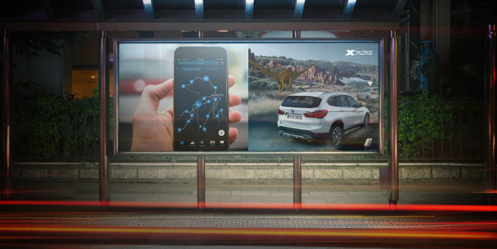
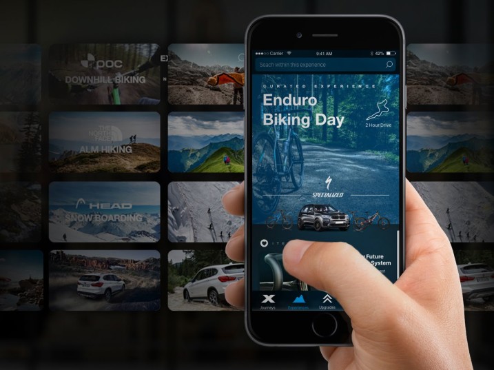
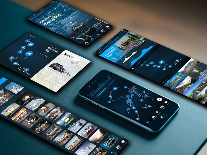
Xplore offers curated mobility experiences that built on the vehicle as the platform. This enables people to book well-planned experiences with less time. It gives users an overview of locally available experiences that include required tickets, the vehicle to rent, equipment for activities, digital content for the journey and offers passengers to personalise their experience for example by ordering needed items to deliver them into the vehicle beforehand.

The digital platforms aim to create a democratic and inclusive experience for everyone before the journey. Therefore everyone can use the platform to individualise their journey experience by getting items to rent or buy into directly into the vehicle. Furthermore, it allows to add stops and propose destinations to stop by during the journey. Users have received the features as very empowering in their relationship to the activity.

The artificial intelligence of the vehicle is accessible for everyone - not just the vehicle owner and driver. Through the app, it answers people’s question for the experience: for example what is the trunk size and does my equipment fit in? The digital companion also warns people in regards to weather conditions and makes sure everyone is always informed and on the
same page. Furthermore, this chat also creates a base for everyone to communicate and stay on top of the journey and planning details.

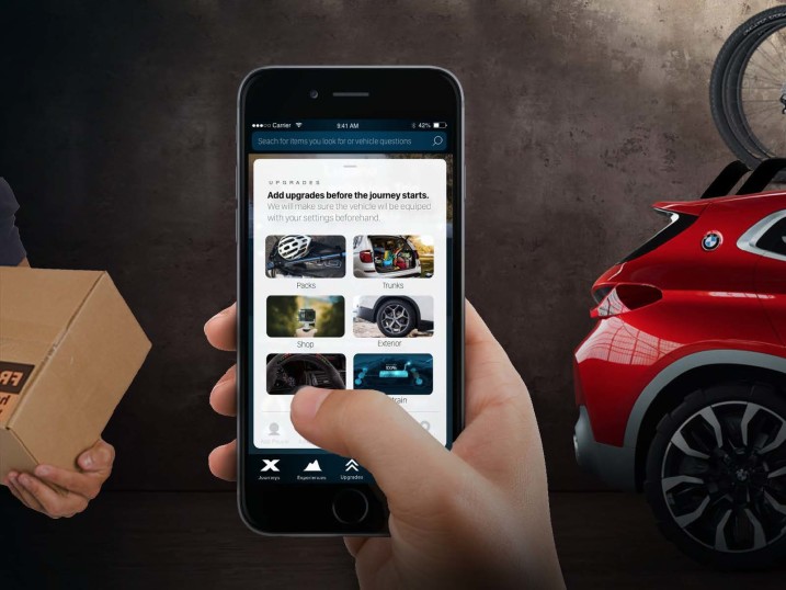
All passengers can select certain “mobility-upgrades” which enable them to deliver journey related items into the vehicle. This can be a piece of equipment for a biking journey or a go-pro people just want to rent for the time of journey for instance. These items then will be delivered to the vehicle before and can also be left at the vehicle after the journey. These interactions explore “dealership services of the future” which are less about selling vehicles but about supporting and providing customer experiences.

When people arrive at the vehicle they get welcomed by a fully prepared vehicle. This warm welcome continues into the vehicle where is users will be personalised welcome and can await their ordered “upgrades”. The rear-seat display creates anticipated excitement through images and things that await along the journey. Furthermore, the entertainment-system democratised the digital aspect within the vehicle and gives everyone access to music, the route and enables people to discover aspects of their surrounding and destination.

In addition, it enables and triggers interaction between people in the vehicle by giving an overview of when the journey becomes interesting and when highlights will appear. This wave-form highlight curve at the top of the interface gives all users something look forward to. It also makes the journey appear and feel shorter by having small highlights distributed throughout the journey.

These highlights can be architectural, historical or nature highlight outside. The system will offer more information around the highlight if requested. By designing intentionally friction into the interaction of having people not knowing what will be next it triggers social interaction and people might discussion and rumour around that.

Furthermore, the system gives all passengers in the vehicle tools, which were usually restricted to the driver, to create a more social and collaborative experience.

During the user research, people often told that typically when a passenger made a discovery outside during the journey they were already past the spot when they could react and look out of the window. Generally, there is just a short amount of time to see and explore anything outside during the speed of the vehicle. Therefore Xplore explores the idea of travelling in time and empowers people to control their environment.

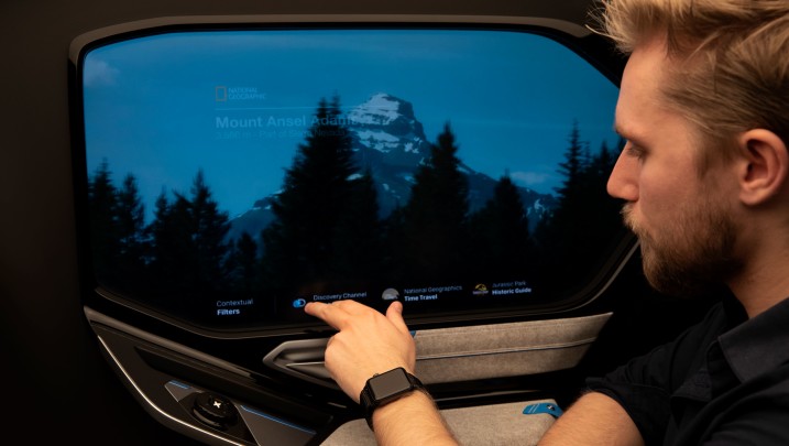
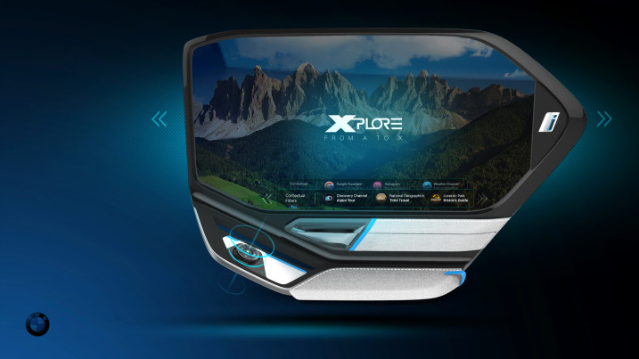
This approach leads to “The Window of the Future” which is based on a TOLED (Transparent-OLED) which enables people to turn from a transparent window to a virtual experience whenever they want. By using the “TimeDrive-Controller” the users can stop the moment and are able to go back in time to take a closer look at what they just passed.

This works by using the data and content of the cameras that face outside and enables autonomous driving capabilities of the vehicle. This content can not just be used to enable autonomous driving functionality but also for an innovative experience like travelling in time.

It even allows you to experience slow motion, take a photo/video or travel into the future by using camera content from other vehicles. It was important to have a physical and not digital element to control this interaction.

The tactile element allows the user to focus on the outside, scenery and view and they can control the interaction without looking at their hands. Another insight from the user research was people often complain that they forget things they discovered. This can range from a restaurant to an impressive architectural building. The window enables people to bookmark what they discover by pushing the “TimeDrive” downwards which gets synchronised with the app and can be shared.

It was important to remove friction in this interaction and create a direct physical element to enable the interaction. Another insight that was driving concepts around the discovery aspect was that people are generally interested in their surrounding
but lack the information to get enough context.

The Xplore window acts as an Augmented Reality platform on which other developers can design experiences. The user can choose from a selection of locally available experiences, for example, Yelp, National Geographic or Wikipedia. The user testing revealed that just a little information and story elevate the view experience - often from not relevant to very exciting and surprising. This approach enables education and is ultimately providing a platform for immersive storytelling and connecting people closer to their context.

The bookmarks and journey documentation can be accessed through the mobile companion after the journey. Digital media will be disturbed to all passengers and can be shared on social media. Bookmarks can be explored and people gain the chance to get more information and educate themselves around interesting spots they saw during the journey. By having a common channel to interact this also makes it easier to share highlights within the group. Besides manual recorded content the window also records content automatically in interesting spots and fills a storybook with automated documentation videos.

Impact

The passive mobility experience will gain incredible importance when we speak about autonomous driving and is a new field of importance. USPs of mobility solutions are shifting from "driving experience" to "time experience". In the design process of Xplore, the focus was to research people's needs, problems, dreams and behaviours when it comes to the passive mobility time through user interviews, co-creation and iterative prototyping of solutions. Getting feedback from users on concepts and using the vehicle and journey as a space to prototype solutions were important parts of the process.

Focusing on empathy lead to new user insights and questions that are not common in the traditional automotive space. The projects also highlight both the importance of friction and seamless when it comes to shaping touchpoints. Friction for example of showing highlight on the horizon will lead to new positive behaviours while removing friction and creating a more seamless experience was one of the main tasks for many other touchpoints for example discovery.

Due to the speed of the vehicle people often just have seconds to experience an interesting view or to take a look at something they find interesting outside. So how might we enable people to go back in time to let them take a closer look at what they just passed? How do we enable people to control their "time and space"?

A paper by IPSOS studying 130.000 people led to the conclusion that “looking out of the window” is the most common use case even when vehicles drive themselves. The Xplore Window enables people to go back in time and have a closer look at what they just passed using the cameras outside that enable autonomous driving and a Transparent-OLED as a side-window which can switch from a transparent normal window to a virtual experience. The content saved from the autonomous driving system (temporally) enables the user to go back in time. One of many new creative interactions in the graduation project that even have been patented.

Furthermore, many people reported they have a hard time to remember where and what they discovered on their way. The Window concept enables people a direct bookmark interaction whenever they discover something interesting outside.

Having tactile interactions for the users to record, remember and control their environment empowers them to control their
surrounding, stay in the moment and not get distracted by documenting with their smartphone.

Building prototypes of such experiences along the process where key enabler to convince stakeholder to invest into higher fidelity of prototypes. It was both a tool to convince stakeholders and experiment around the experience but even more important to get user feedback and see if the problems and sights were solved in the right manner.

Conclusion

Ultimately the project highlights how much exploration of new and different touchpoints is possible as we move towards autonomous driving. Touchpoints can be shaped to solve problems for users and create an impact not just on the functional level but on the emotional level as well which was a target for this project.

A very unique aspect of this Service Design project was the direct impact on not just the digital side but on the hardware and tactile experience as well. By coming from user needs, problems and understanding the subtleties around emotional needs and the friction around them it had a direct impact and requirement to design new hardware to solve this problem: in this case an AR/VR side-window.

Having such hardware wasn’t set out as a requirement is the beginning but tuned out to be the way to solve insights gained
around touchpoint and their friction. Prototyping this experience has been a crucial enables and the fidelity of prototypes is something that is unique to the project. The service was iteratively prototyped on the app interface, the in-car screen as well as the side-window prototype.

Making connecting between touch-points and iterate on all of these touchpoints along the intense 6-month project has been very challenging but necessary. Personally, this would have been possible without constant user feedback and without using the vehicle as a place to prototype and design to elevate the level of immersion and empathy.

Related Community Knowledge

Service Design Award Goodwill Storyshare: The Journey of Kindness

Goodwill Storyshare: The Journey of Kindness

Service Design Award 2024 - Student Finalist

Continue reading
Service Design Award Connect & Adopt Shaping Adoption Journeys

Connect & Adopt Shaping Adoption Journeys

Service Design Award 2024 - Student Finalist

Continue reading
Service Design Award Service Design for NORCS

Service Design for NORCS

Service Design Award 2024 - Student Finalist

Continue reading
Service Design Award Transitions in Care

Transitions in Care

Service Design Award 2024 - Finalist

Continue reading