Continuum: Digital Wayfinding Design & Prototype

In 2017, a major airline made some big changes to its brand. They rolled out shiny new planes. They outfitted their people in stylish new uniforms and revamped their cabins. Their in-flight game was tight, but when customers walked through the door of the airport, their experience wasn’t quite up to the same level.

The Service Design Award is currently open for submission again. Submit your project for a chance to win and present at the Service Design Global Conference in Toronto this year.

THE CHALLENGE

In 2017, a major airline made some big changes to its brand. They rolled out some shiny new planes. They outfitted their people in stylish new uniforms and revamped their cabins. Their in-flight game was tight, but when customers walked through the door of the airport, their experience wasn’t quite up to the same level.

While the airline was known for delivering best-in-class hospitality on their airplanes, they sought to improve the in-airport customer experience, so travelers could get to their destination confidently while spending less time worrying about the journey.

We began by talking with customers, frontline employees, and the airline’s operations teams to understand the broader context and the operational constraints. Based on these conversations, we identified three challenges that needed to be solved:

  1. LACK OF CLEAR AND ACCURATE INFORMATION

    We saw an urgent need to provide accurate information about flight status, departure gates, and departure times. We needed to stream contextually relevant information to customers and employees, in order to build their trust and improve their airport experience.

  2. EXCESSIVE GATE CROWDING

    Because of the airline’s unique boarding process, it’s
    important to keep the gate area organized. Passengers aren’t
    assigned seats, but board in small groups. The process is both
    empowering—you get to choose your seat—and it creates
    more anxiety (is my group lining up?) I don’t want to lose my
    spot!) which creates a unique tension for the airline. Building
    on the brand’s penchant for doing things a little differently, we
    needed a unique way to address this issue that would serve
    customers well.

  3. NEED FOR MORE MEANINGFUL CUSTOMER SERVICE

    Different types of customers are often looking for similar
    information at each point in their travel. We needed to
    deliver answers to common questions (Is this the gate for
    Boston? How full is the plane?) so that repetitive employee
    interactions could be reduced while improving
    customer sentiment.

RESEARCH & INSIGHTS

STRAIGHT TO THE GATE

Over time, travelers have grown skeptical of signage and information in the airport. The flight board lists one time, while the screen at the customer service desk lists a different one, and your app just alerted you with a third time. Simply put: Information is too often inconsistent, or just plain wrong. In order to compensate for this lack of trust, travelers have been conditioned to go directly to the gate and have developed their own tricks to determine if their flight will be on time. Is the plane there? Has the incoming flight arrived? Is a crew waiting in the gate area? Has the operations agent taken their position by the door? To keep people from crowding the gate area, we needed to rebuild this trust by sharing more accurate information in more locations.

INFORMATION OVERLOAD

In a busy environment, customers and employees need to understand each piece of information as quickly as possible in order to make good decisions. Based on three rounds of iterative consumer and employee research, we identified key user needs within the airport and designed signage to display only absolutely relevant information at each step
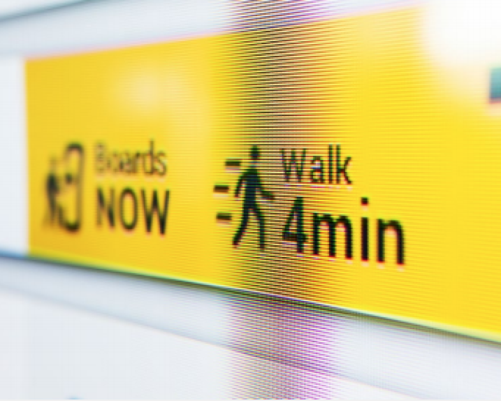
of the customer journey. If a traveler is early, signs redirect them to food, shopping, and empty gate areas so they can go power their devices. If a traveler is running late, the enhanced wayfinding helps to make the dash through the airport faster with directional arrows, walking times, and an easy-to-understand signage system. That way, customers make their flight, and the airline gets their planes out on time. Everyone wins.

LEVERAGING THE AIRLINE’S BRAND

As we talked to customers, we learned that they loved the airline and trusted the brand more than other airlines, or the airports themselves. We heard that clear, natural language, instead of cold numbers and data, helped build trust by creating a personal touch. We also saw a need to celebrate the airline’s employees, because when customers understood
the effort that went into getting them to their destination on time, they were much more understanding of delays. With the right language and a proper recognition of employee efforts, the airline’s brand had the potential to create moments of joy that could break through a stressful airport experience.

HUMAN-CENTERED DATA

Airlines have a massive amount of data at their fingertips; unfortunately, most of it is not formatted or available in a way that is meaningful to customers. At times, this data is so steeped in industry jargon it is almost incomprehensible. The airline had their own problem with data being inaccurate across touch points: the airline had been working with old
systems, and not all channels were synchronized. Sometimes the mobile app had information before the agents did. In order to create a system that truly worked for travelers, we’d have to bring together dozens of different systems and connect data points in a meaningful way to help the airline eventually create a system of seamless connectivity.

SOLUTION

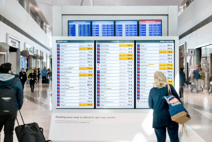
Working closely with the airline’s innovation, operations, and data science teams, we designed a new digital wayfinding system to guide customers through the airport. Based on customer and employee feedback, we redesigned all of the existing airport signage and added new sign types at key locations throughout the airport. Each sign in the new system was fully digital and location-aware, so that we could tailor each sign based on time of day, flight status, and customer needs.

Knowing that installing new hardware inside of a highly regulated airport and developing a functional back-end is a costly and logistically complicated task, we made sure to test the system responsibly before moving into a live in-market prototype. This included mocking up a full-scale airport, using foam-core and projectors, in order to conduct user testing and modeling the entire airport in virtual reality to understand sight lines and sizing. These steps helped build buy-in within the organization by allowing us to socialize the new concept in a compelling and easy- to-understand manner. We also ensured that the system resonated with both customers and employees before the airline made a major investment.

After successfully testing our concept with consumers via a low-fidelity mock-up, the team brought the experience to real users, live, at an airport, during the busiest travel time of the year. The experience was built on a similar infrastructure that will eventually be deployed at scale, so that technology can be tested simultaneously with the user experience.

We brought the airline’s brand to life using natural language and a whole lot of love in our signage. We brought the personality of employees into the signage as well. Customers can learn more about their operations, their employees, and can even give the ground crew a virtual “high five” to say thank you. Throughout the design process, we kept employees in mind, too. The system is designed to answer common customer questions, so employees can spend more time providing great customer experiences and less energy looking up flight times.

RESULTS

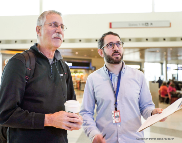
We spent seven weeks testing this new experience live in an airport—with more than 300,000 passengers. We followed customers, observed behavior, talked with employees, and gathered surveys and metrics.

Customers recognized and responded positively to the natural language and personality of the airline throughout the system: 96% of customers said the new signs made it easier to navigate the airport, and customers rated the usefulness of the new system as 4.77 on a 5-point scale. Additionally, the airline’s positive reputation gave the signs added credibility with many customers. The added information improved the overall usability of the airport and the digital signage dramatically helped those with visual impairments.

Employees have already noticed a reduced number of repetitive customer questions—specifically, questions about connecting flights and flight capacity. General confusion regarding active flights in each gate area has decreased appreciably with the new system.

The result: the airline can now provide more meaningful customer service and hospitality. This work was beneficial not only for customers, but also for employees. In fact, employees liked it so much, that they asked to extend the pilot through the busy Thanksgiving holiday. The technology took the
redundancy out of customer-employee transactions and allowed the airline to care for customers in truly meaningful ways.

Overall, the feedback from customers and employees was extremely positive, and the airline is planning pilot deployments of the entire system in three airports by the end of 2018.

Related Headlines

SDN Chapters SDGC24 Replay tickets available for purchase

SDGC24 Replay tickets available for purchase

In case you missed the Service Design Global Conference 2024, you can purchase Replay access to all recordings and view them at your leisure until October 4, 2025.

Continue reading
SDN Chapters Achieving Interdisciplinarity—Touchpoint Vol.15 No.2 is out!

Achieving Interdisciplinarity—Touchpoint Vol.15 No.2 is out!

In this issue of Touchpoint, we focus on interdisciplinarity itself. What does success look like, and what are the tried and tested methods to achieve it?

Continue reading
SDN Chapters Service Design Global Conference 2024 - Virtual tickets still available!

Service Design Global Conference 2024 - Virtual tickets still available!

Join us for the Service Design Global Conference (SDGC24) this October! Our in-person tickets are sold out, but you can still register for the full virtual experience and be part of this inspiring event. See you there!

Continue reading
SDN Chapters Touchpoint 15-3 Call for Papers deadline extended: “Designing from Within”

Touchpoint 15-3 Call for Papers deadline extended: “Designing from Within”

As the practice of service design continues to gain recognition and traction, a notable trend has emerged: organisations are choosing to build and utilise in-house service design teams rather than relying on external agencies. This shift brings with it a host of considerations, both positive and negative, that merit in-depth exploration and critical reflection.

Continue reading